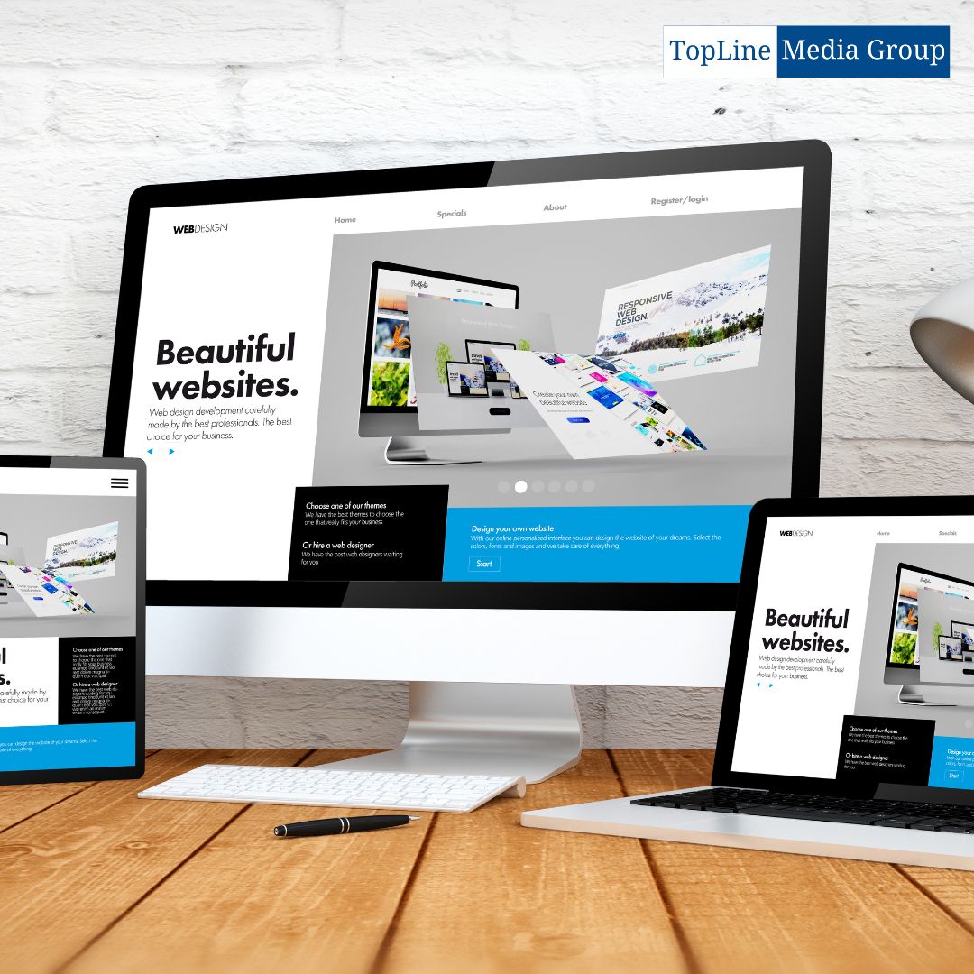
In today’s digital landscape, where mobile devices have become an integral part of our lives, having a responsive website has become crucial. Responsive web development ensures that a website adapts seamlessly to different screen sizes and devices, providing an optimal browsing experience to users. This article delves into the world of responsive web design, covering its importance, techniques, optimization, and future trends.
Understanding Responsive Design
Responsive design involves a combination of flexible layouts, images, and CSS media queries. Flexible layouts allow the content to adjust proportionally based on the screen size, while media queries enable the website to apply specific styles based on the device’s characteristics.
The Role of HTML and CSS in Responsive Images
HTML and CSS play a significant role in creating responsive websites. HTML provides the structure and semantic markup, while CSS controls the layout, styling, and responsiveness of the web page. Media queries, a CSS feature, enable the adaptation of styles based on the screen size and resolution.
Choosing the Right Image Format
Images are integral to web design, but they can significantly impact a website’s performance. When it comes to responsive web development, choosing the right image format is crucial. Formats like JPEG, PNG, and SVG offer different benefits and should be selected based on factors such as image complexity, transparency requirements, and file size.
Techniques for Responsive Image Loading
Loading images efficiently on different devices and screen sizes is essential for optimal performance. Techniques like lazy loading, which delays the loading of images until they are needed, and adaptive images, which deliver different image sizes based on the device’s capabilities, help improve loading times and user experience.
Image Optimization and Compression
To ensure fast loading times and optimal performance, images should be optimized and compressed. Techniques such as image compression, resizing, and caching can significantly reduce file sizes without compromising visual quality. This enhances the overall user experience and minimizes bandwidth usage.
 Responsive Image Testing and Debugging
Testing and debugging responsive images is crucial to identify and resolve any issues that may affect their display or performance. Various tools and techniques, such as browser developer tools, responsive design testing frameworks, and real device testing, can help ensure that images appear correctly and load efficiently across different devices.
SEO Considerations for Responsive Images
Search engine optimization (SEO) is essential for improving a website’s visibility in search engine results. When it comes to responsive images, alt tags, descriptive file names, and proper image sizing and optimization play a crucial role in ensuring search engines can understand and index the images effectively.
Future Trends in Responsive Images
As technology continues to advance, so does the field of responsive web development. Some future trends in responsive images include the use of next-generation image formats like WebP and AVIF, the implementation of art direction to deliver specific images based on context, and the adoption of responsive imagery standards by content management systems and frameworks.
Conclusion
In a mobile-first world, responsive web design and development have become paramount for delivering exceptional user experiences across devices. By embracing the principles of responsive design, optimizing images, and staying up to date with emerging trends, web developers can create websites that captivate and engage users while providing seamless access to content.
FAQs
What are the best image formats for responsive web design?
When it comes to responsive web design, the choice of image formats depends on various factors. For photographs and complex images, JPEG is often the preferred format due to its efficient compression. For images with transparency, such as logos or icons, PNG is a suitable choice. Additionally, the emerging WebP and AVIF formats offer advanced compression and support for modern browsers, making them worth considering.
How can I optimize and compress images for the web?
To optimize and compress images for the web, several techniques can be employed. Firstly, resizing images to the appropriate dimensions can reduce file sizes. Secondly, compressing images using tools like JPEG compression or PNG optimization can further minimize file size without significant loss in quality. Additionally, leveraging caching mechanisms and content delivery networks (CDNs) can enhance loading times by serving optimized versions of images to users.
How do I implement lazy loading for responsive images?
Lazy loading is a technique that defers the loading of images until they are needed. To implement lazy loading, you can utilize JavaScript libraries or frameworks specifically designed for this purpose. These libraries enable the lazy loading functionality, ensuring that images are only loaded when they enter the user’s viewport, thereby enhancing performance by reducing initial load times.
What is the difference between Retina and Hi-DPI displays?
Retina and Hi-DPI displays are terms often used interchangeably, but they refer to slightly different aspects. Retina displays are a brand-specific term coined by Apple, referring to high-resolution displays with pixel densities high enough that individual pixels are indistinguishable at a typical viewing distance. Hi-DPI displays, on the other hand, encompass a broader range of high-resolution displays across various brands and devices.
How can I ensure my responsive images are accessible?
To ensure accessibility of responsive images, it’s important to provide descriptive alternative text (alt text) for each image. Alt text should convey the image’s content and purpose to visually impaired users who rely on screen readers. Additionally, adhering to proper HTML structure, using semantic markup, and considering color contrast can further enhance the accessibility of responsive images.
 What tools can I use to test and debug responsive images?
Several tools are available to test and debug responsive images. Browser developer tools, such as Chrome DevTools and Firefox Developer Tools, offer features like responsive design mode, which allows you to simulate different screen sizes and test image behavior. Additionally, online services like Google PageSpeed Insights and Lighthouse can provide insights and suggestions for optimizing and improving the performance of responsive images.
How do responsive images affect SEO?
Responsive images can positively impact SEO when optimized correctly. By providing appropriate alt text, descriptive file names, and optimal image sizes, search engines can better understand the context and relevance of the images. Additionally, fast loading times resulting from optimized images contribute to a better user experience, which indirectly affects SEO rankings.
What are the future trends in responsive image optimization?
The future of responsive image optimization is filled with exciting possibilities. Some anticipated trends include the widespread adoption of next-generation image formats like WebP and AVIF, which offer superior compression and quality. Additionally, the implementation of art direction, where different images are delivered based on contextual factors, can provide tailored experiences. Furthermore, advancements in content management systems and frameworks are likely to streamline and standardize responsive image handling, making optimization more accessible and efficient.


